Branding is never about just visual perception or verbal message. Branding is about the whole image people get hearing the name of a company or seeing its brand identity signs. So, designing the signs and symbols which make a brand recognizable and transferring the appropriate message is a job with great responsibility. Still, there is one more stage of the process when this sort of responsibility get another shade. It happens at the point of branding redesign.
We have already published case studies with the stories of creating logos and brand identity concepts at the early stages of their business path. However, this time the story will have another flavor as we are presenting you the case of logo redesign for a company that is already recognized and actively operating on the market. The task was to create new brand identity not breaking already gained links and associations. The designer assigned for this task was Arthur Avakyan whom you probably remember from cases of Ribbet, Passfold, Tubik, Saily and SwiftyBeaver logos.
Task
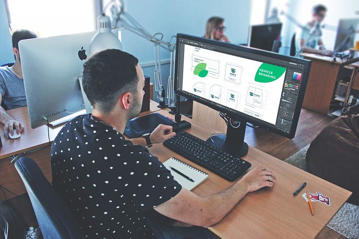
Redesign of a logo for a commercial and holistic landscape firm Andre operating in landscape maintenance, tree care and design.
Tools
Pencil sketching, Wacom Intuous pen tablet, Adobe Illustrator, Adobe Photoshop
Process
First of all it was important for the designer to study the conditions and philosophy of existing logo functionality, details about company activities and business goals and customer’s wishes about the redesign process. It should be mentioned that redesign for existing companies and products can have different levels of breakaway from the existing versions: some companies decide upon fully new design which has nothing in common with the current branding, while others keep the track of changes carefully and gradually, with minor alterations eliminating the risk of losing recognizability on the market.
The second approach was taken as a basis in this particular story, because Andre is a company that has already won its audience on the market. That means any design change should be done with respect to the company’s history and philosophy as well as brand image grown through the years. Therefore, new design had to take its roots from the existing branding, but offer some refreshment and add some trend.
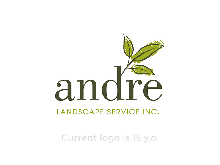
Certainly, to find the sign representing the brand, the designer needs to know as much as possible about the brand, its business goals and statement. Andre is a medium-size company based in the USA and providing all sorts of services linked to landscape care and design of any complexity. The company is family-owned so its name origins from the last name of the family. The customers wanted a new logo to be quite classic, memorable, enduring and setting the strong association with land care. So, it was important initially to provide the visual sign that will instantly inform observers about the nature of the business and create positive vibes via harmonic combination of shapes and colors.
After the market research and getting deep into the requirements and background of the company, the designer worked over the first series of sketches and offered the first version for redesign. It was based on the round shape and featured green leaves as the central element of composition. The designer also selected the corresponding version for the name lettering so that it looked readable and harmonic in combination with the image, supporting it but not overloading general visual presentation. Combination of several shades of green with light blue set the image connected to key concepts of business activities: nature, landscape, plants, trees, sky. The designer applied smooth and rounded lines of different stroke weight and provided the variants filled with color as well as glyph one.

Another concept offered more linear and geometric variant also featuring the leaf motif and using a shape inside reflecting the form of capital A letter.

Although the offered style was appropriate, the customers insisted on applying the mascot in the logo image. The choice was made in favor of a bird and the designer offered the graphic option featuring the bird as a logo image. It also was applying the form of the leaf in the image used separately, but in combination with lettering the leaf was placed closer to the letters.

One variant of a logo featuring the bird mascot used the image with the shorter beak and an eye featuring the mimic expression of smile.

The idea of “smiling” positive expression was also tried in the variant in which the bird was inscribed into the circle. The beak directed upwards moved out of the circle setting the feeling of progressive flight, while the wing featured the form and visual marks of the leaf.
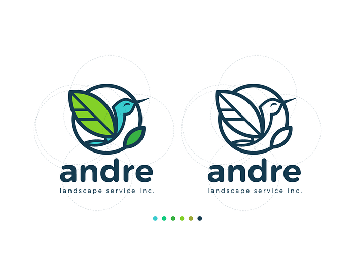
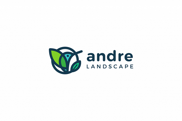
The general concept of applying the bird in the logo was set and agreed upon, but the customer and the designer decided on trying another iteration experimenting on simplification of the bird’s silhouette to make the logo not only attractive and meaningful, but also clearly visible and legible in any size. This stage of creative search resulted in a new shape combining the visual concept of a bird and of a leaf in one image.

The final choice was made in this direction, which efficiently presented the mascot in clear simple forms, preserved color combination associated with the nature of the offered services and vibes of green and natural background.
This case of logo design has proved once again that user research, market research, thorough attention to the customer’s requirements and inspired creative search together make a great basis for efficient, informative and attractive branding. Don’t miss the next case which will show the application of the described branding solutions on diverse set of branded items.

Originally written for tubikstudio.com
Welcome to see the designs by Tubik Studio on Dribbble and Behance
Welcome to see other works by Arthur Avakyan on Dribbble and Behance
Welcome to Tubik Blog
