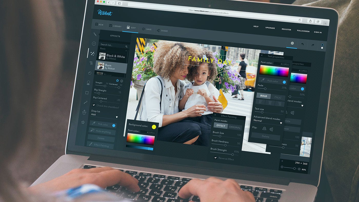
One of the latest issues of FAQ Design Platform in Tubik Blog has been concentrated on the role of some visual elements of branding for creating efficient and high-quality user interface design. Today we would like to share some of the ideas with our Medium readers. The post is based on the thoughts provided for the question on Quora where we are happy to share our ideas, knowledge and experience.

So, the original Quora question we are answering today was the following.
Why is branding essential in user interface?
Let’s start with clear definitions of the core term here to specify what will be meant behind it in the answer. So, branding in general is the set of marketing and psychological techniques and steps aiming at promotion of a product, service, persona etc. first of all via setting a brand.
Brand in this case means a sort of image created via a set of distinguishing features and promoting awareness and recognizability of the product or service on the market. This image can be created in tons of diverse ways which can be visual, verbal, touchable etc.
In terms of graphic design assets, branding can be realized via the set of visual elements, the most widely used of which are:
- logo;
- brand colors;
- typography: lettering as a part of the logo or full representation of the logo (wordmark); types and fonts used via digital as well as physical products representing the brand;
- graphic elements such as, for example, illustrations, design of letterheads, business cards and other print assets;
- templates for corporate presentations etc.
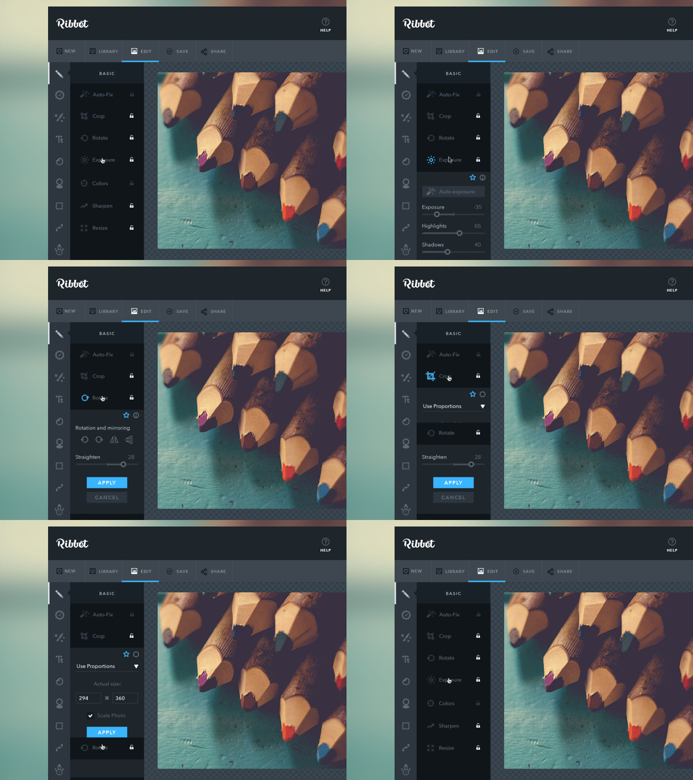
In the discussed question covering the aspect of branding in UI design, branding supposedly means first of all a set of visual elements defining brand style which can be applied in the interfaces such as logo, typography, brand colors and the like. All of them together are a powerful tool of creating visual recognizability of the product as well as its style. Being based on the analysis of target audience and marketing/customer research, branding in this sense plays the vital role on product promotion as visual perception is very fast and easy for most people, much easier than reading the text and much more memorable than listening to speech.
Path 1: From branding to UI
Answering on the basis of practical experience of work in UI/UX projects accomplished by studio team, we could confidently say that branding IS essential in user interface, especially in case when you want to use the interface as the additional flow of user attraction as well as the way to increase brand awareness.
If you take the time on proper marketing and user research, define your target audience, analyse competition and on the basis of all that data have branding elements, first of all logo, created by a professional designer before launching the process of UI design, your product immediately gets higher chances of getting recognizable faster and easier.
The reason is simple: UI designer working on the interface, its color palette, shapes, types and fonts, illustration and icons, will consider design solutions appropriate and corresponding to the general branding concept of the product that will make them mutually supporting each other. It provides more natural and harmonic feeling of the brand in general and the particular interface as the integral part of this brand.
Providing you with practical examples giving real experience, we could mention case studies by Tubik Studio designers on branding and UI design process for the Saily App and Passfold. Working on branding style and then UI solutions for e-commerce and mobile application, studio designers understood how beneficial strong mutual support between branding and general interface design can be for the product and its further promotion. Practice proved that this strategy was completely right.
Welcome to run through the details and graphics of design process following the links below the images representing the projects:
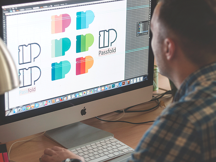

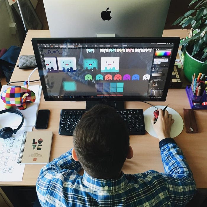

Both cases have proved that in brand positioning and promotion, using the concept of strong corporate style and applying the elements of branding such as logo, lettering and illustrations consistently was the effective strategy. It is important to remember that user interface of an application or a website is not just a sort of static or moving images — it is the field of active interaction. Interaction with the product via the interface enhances much higher memorability potential of brand elements as well as general stylistic concept.
Path 2: From UI to branding
One more important question to ask here on the basis of everything above mentioned is the following: is it possible to create the efficient UI design without particular branding elements designed beforehand? The answer is certainly positive. Yes, it’s possible and there are lots of examples. However, in this case UI will not work on brand recognizability as effectively as if with branding elements included. These two different powers of attracting and engaging customers will somehow work separately, not supporting each other.
However, if UI is really amazing and product is useful, in case it gets popular there can be a reverse process: UI itself becomes the strong element of branding due to its popularity and determines all the further solutions on branding design.
For example, it happens that customers cannot afford design of branding and UI design for a product simultaneously, for example, when it is a startup with a limited budgeting. Certainly, they will start with UI design and general stylistic concept will be accomplished right in the process of interface creation out of thin air, not being based on previously made decisions about branding and promotion. If the product, being useful, usable and well-designed, becomes popular and at the later stage its owners decide on creating particular graphic assets for branding, it is highly probable that this sort of solution will be based on already existing UI graphics as soon as it already represents the product and is the basis of brand awareness and brand image.
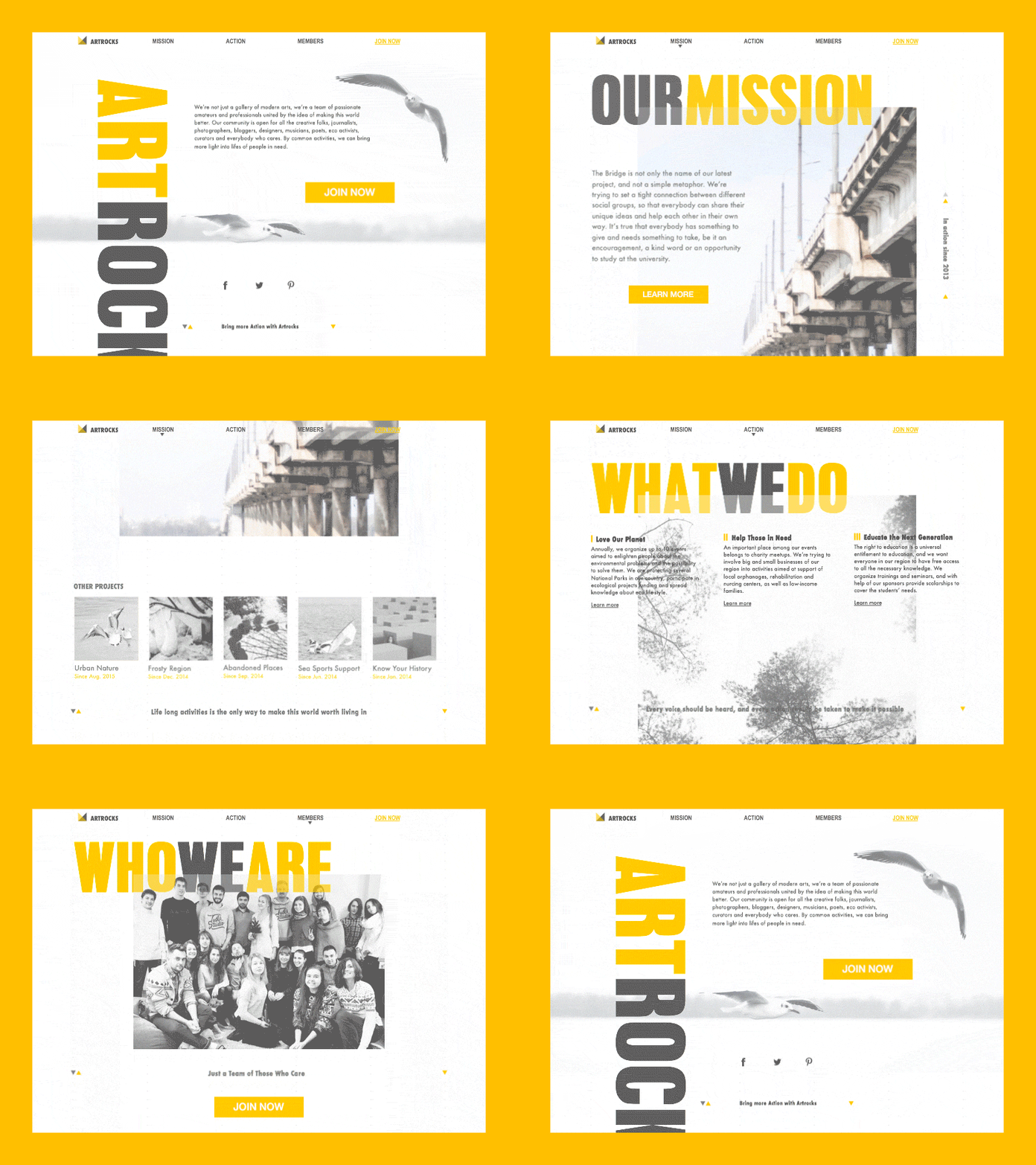
There are also cases when general branding elements such as logo, corporate colors, fonts and the like are totally different from stylistic concept of UI for the product. It sometimes is done purposefully in case when marketing strategy for some reason presupposes that there shouldn’t be visual connection of brand image with the product and an application or a website should not be strongly associated with the brand in general. However, in cases when this kind of difference is not the part of well-thought-out strategy but just a lapse in general design and marketing process, it can have really negative influence on promotion and conversion rates.
We are open to share our experience, so if you have any issues to discuss together, feel free to ask them via direct message in our Facebook page or Twitter as well as to our Quora representative. New answers are coming soon!
Originally written for tubikstudio.com
Welcome to see the designs by Tubik Studio on Dribbble and Behance
Welcome to Tubik Blog
Welcome to read us on Quora
